branding.
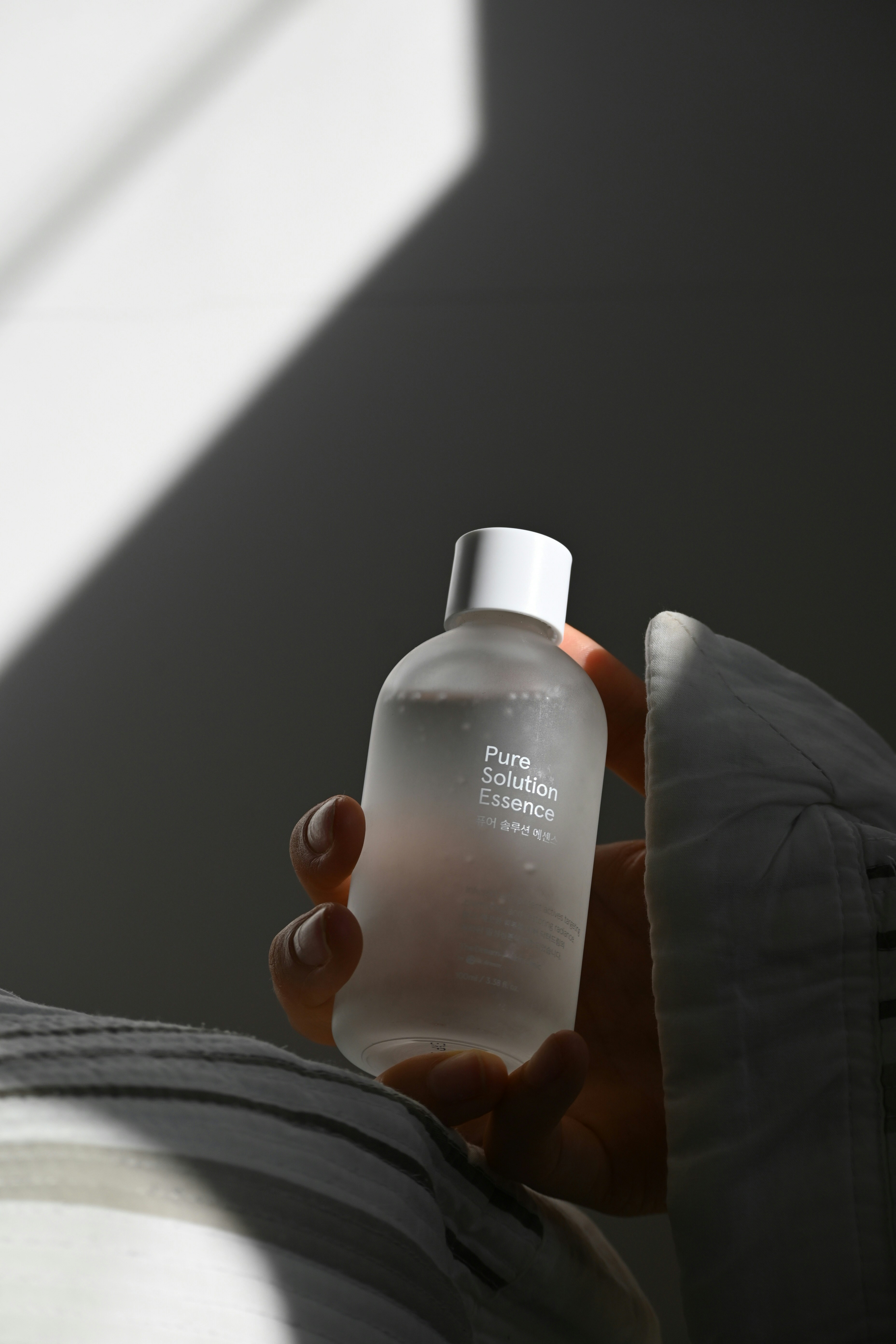
Korean skincare essence infused with potent actives targeting blemishes and restoring radiance.
Client:
TheDream SkinClinic
Completed:
2025

Creating a minimal, clinical aesthetic for K-beauty innovation.
TheDream SkinClinic approached us to develop a sophisticated brand identity for their flagship product—Pure Solution Essence. As a leader in Korean dermatological skincare, they needed packaging that conveyed both clinical efficacy and elegant simplicity.
Our challenge was to create a visual language that bridges the gap between pharmaceutical credibility and the aspirational beauty of K-beauty, appealing to skincare enthusiasts who value science-backed formulations.


Typography.
Display Typeface:
Cormorant Garamond — Elegant, refined serifs for headings
Body Typeface:
Pretendard — Clean Korean-English sans-serif for body
Color Palette.
A refreshing brand that made waves in the market.
your project
matters.
let's chat.