branding, packaging.
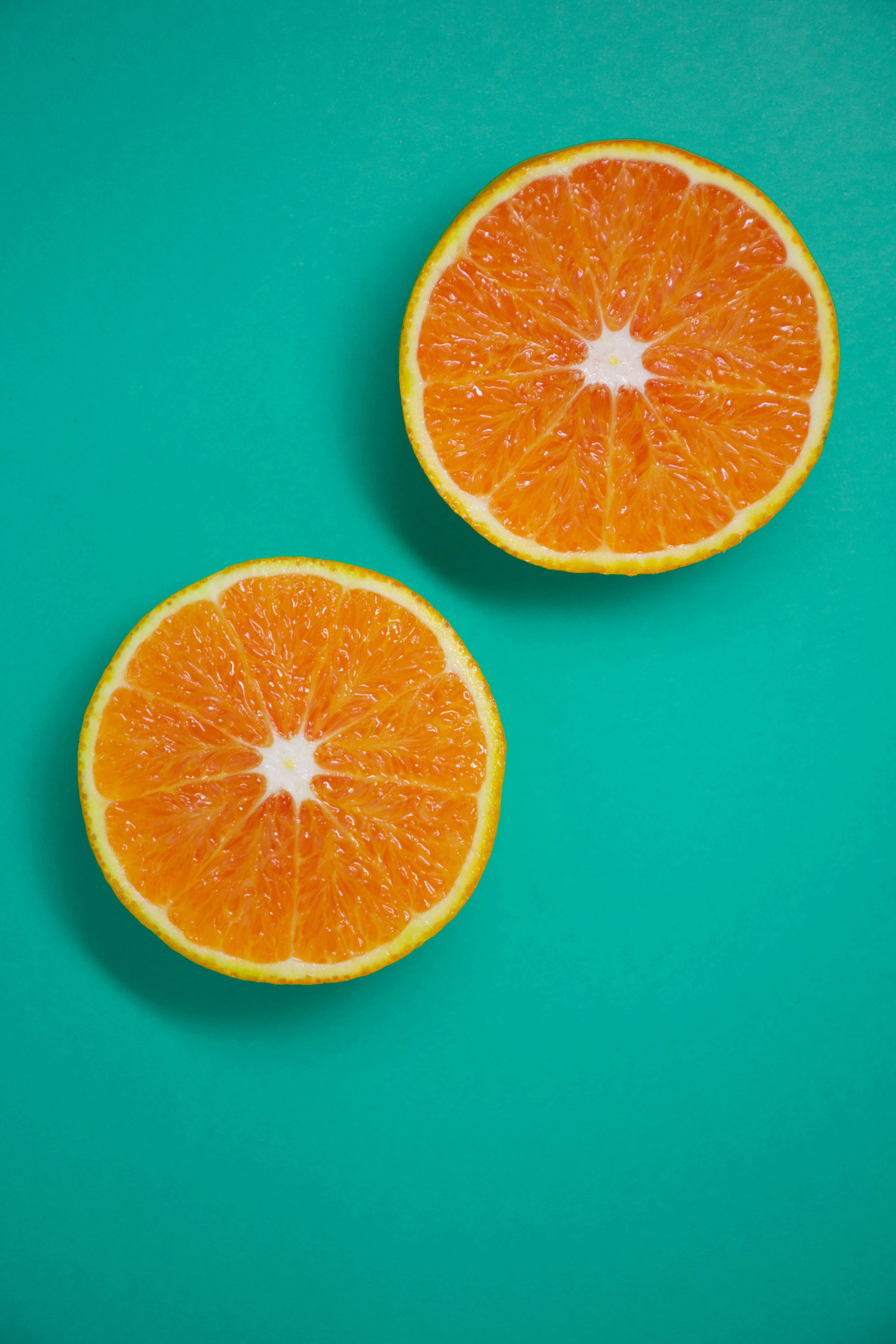
100% natural fruit juices crafted with fresh ingredients and zero added sugars.
Client:
KARIZ Natural Juices
Completed:
2025
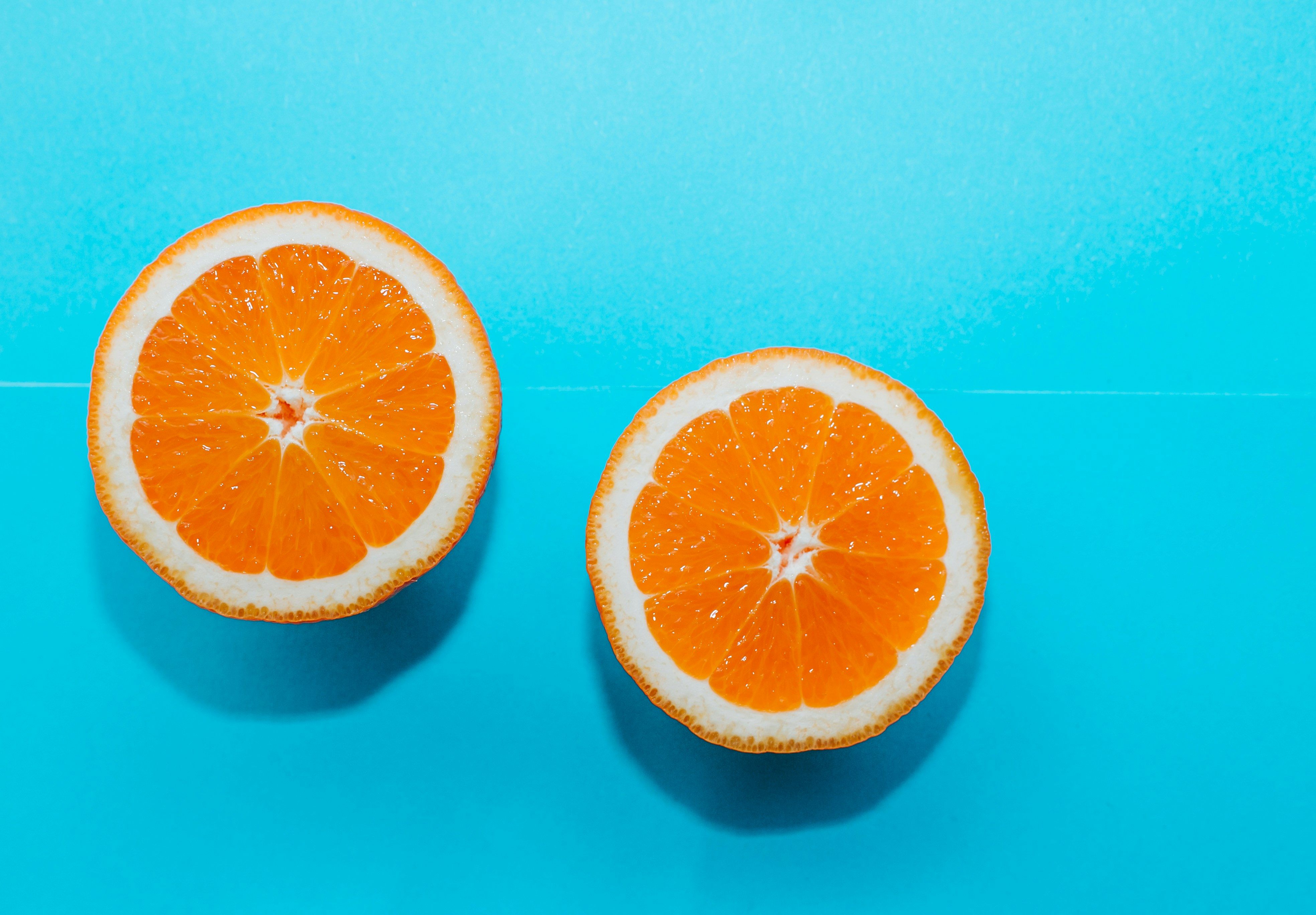
Fresh, natural, and bursting with vitality.
KARIZ approached us to create a vibrant brand identity that would stand out in the competitive fresh juice market. They needed packaging that communicated freshness, health, and premium quality.
Our solution combines bold tropical colors with clean typography, creating an instantly recognizable look that pops on retail shelves and appeals to health-conscious consumers.

Typography.
Display Typeface:
Playfair Display is used for headlines and key brand messaging, bringing a sense of craft and elegance to the identity. Its expressive forms add character and warmth, elevating the brand while reinforcing a natural, premium feel.
Body Typeface:
DM Sans is applied to body copy and product information for its clarity and readability. Clean and modern, it supports transparent communication and ensures nutritional details are easy to understand, reinforcing the brand’s commitment to simplicity and honesty.
Color Palette.
A refreshing brand that made waves in the market.

your project
matters.
let's chat.